Technical Analysis is about trading with the trend
Note: This technical analysis is for educational purposes. Please conduct your own analysis or consult a financial advisor before making investment decisions. The author of this article may hold long or short positions in the featured stocks or indexes.
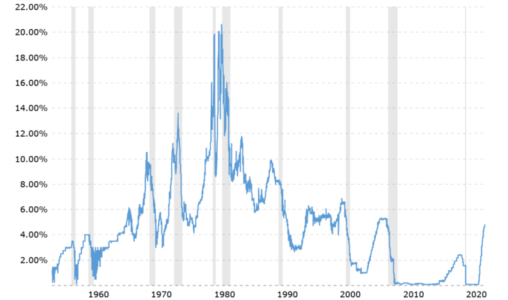
Here is the daily level of the federal funds rate back to 1954. The fed funds rate is the interest rate at which depository institutions (banks and credit unions) lend reserve balances to other depository institutions overnight, on an uncollateralized basis. The Federal Open Market Committee (FOMC) meets eight times a year to determine the federal funds target rate. The current federal funds rate as of April 12, 2023 is 4.83%.
Technical Analysis is about trading with the trend
Note: This technical analysis is for educational purposes. Please conduct your own analysis or consult a financial advisor before making investment decisions. The author of this article may hold long or short positions in the featured stocks or indexes.
We use cookies to ensure that we give you the best experience on our website. If you continue to use this site we will assume that you are happy with it.Ok